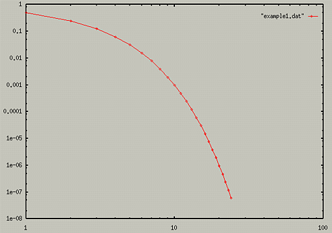
# Example1.dat
# number of subint.   - width of subinterval, computed value, abs. error
0 1			5		 0.00673794699908559
1 0.5			5.0009765625	 0.00576138449908559
2 0.25			5.00317121193893 0.00356673506015159
3 0.125			5.00478985229103 0.00194809470805701
4 0.0625		5.00572403277733 0.0010139142217529
5 0.03125		5.00622120456923 0.000516742429855555
6 0.015625		5.00647715291715 0.000260794081935245
7 0.0078125		5.00660694721608 0.000130999783004349
8 0.00390625		5.00667229679632 6.56502027673866e-05
9 0.001953125		5.0067050843668  3.28626322820824e-05
10 0.0009765625		5.0067215063061  1.64406929883398e-05
11 0.00048828125	5.00672972430911 8.22268997247022e-06
12 0.000244140625	5.00673383506831 4.11193077187733e-06
13 0.0001220703125	5.00673589088727 2.05611181058885e-06
14 6.103515625e-05	5.00673691890656 1.02809252577885e-06
15 3.0517578125e-05	5.00673743294363 5.14055459532869e-07
16 1.52587890625e-05	5.00673768996904 2.57030048800289e-07
17 7.62939453125e-06    5.00673781848355 1.28515534214557e-07
18 3.814697265625e-06   5.00673788274127 6.42578132925564e-08
19 1.9073486328125e-06  5.00673791487013 3.21289537197345e-08
20 9.5367431640625e-07  5.00673793093482 1.60642699142954e-08
21 4.76837158203125e-07 5.00673793896686 8.03222910406021e-09
Note that lines beginning with a # are considered comment lines and are ignored. To plot this data, you can type the following: (if the file isn't in the first level of your home directory, you can specify the full path, or see the directions on Saving and Loading From a file for information on changing directories.)
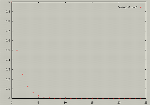
This plots points (x, y) where x is from the first column and y is from the second column. To make the graph a little easier to read, you could type the following:(for information on these, see logscale, Line Style)
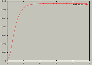
Or to plot the third column against the 4th column,
Copyright © 1996 College of Natural Sciences. All Rights Reserved.
Last Modified: 11/5/96